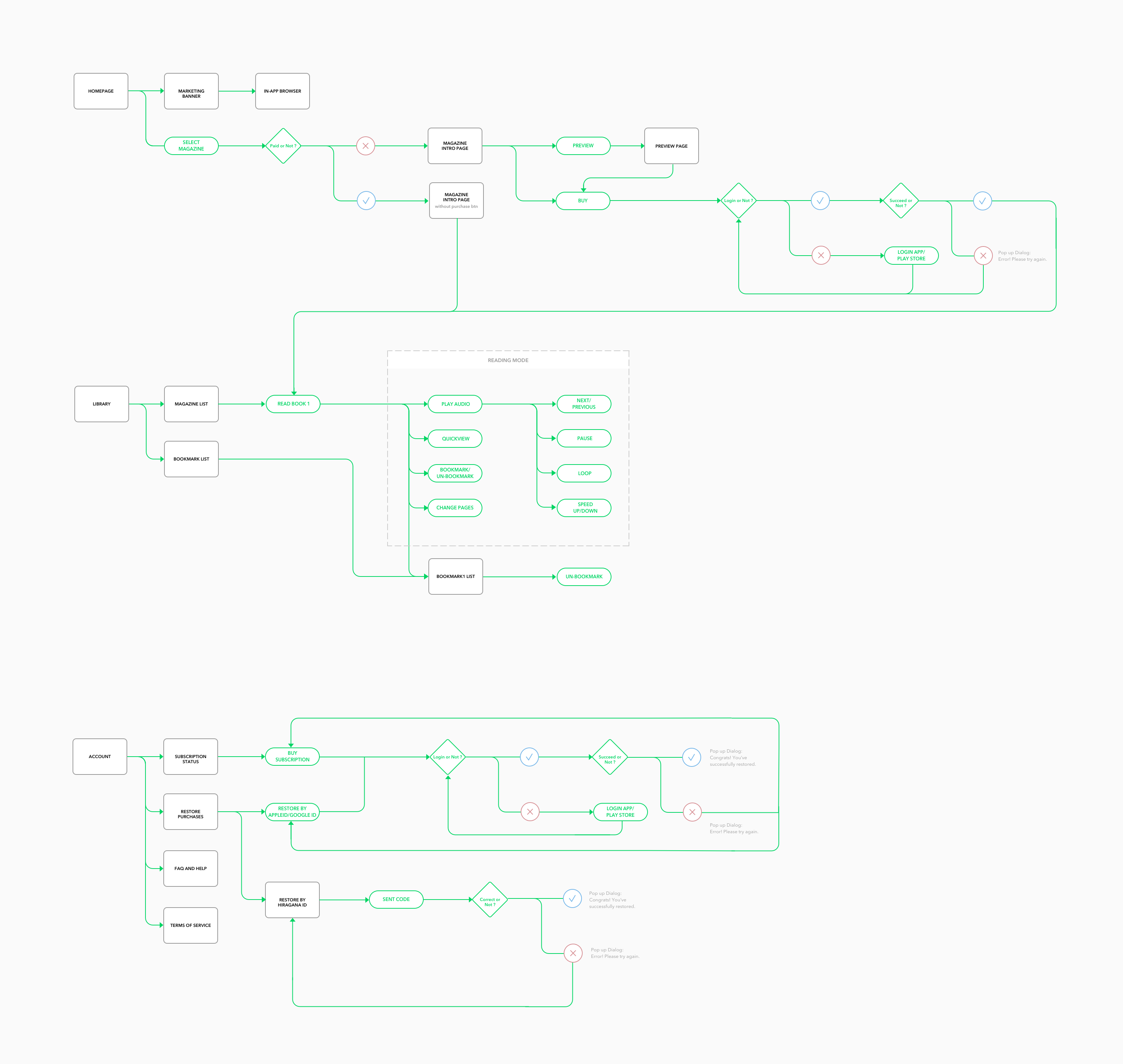
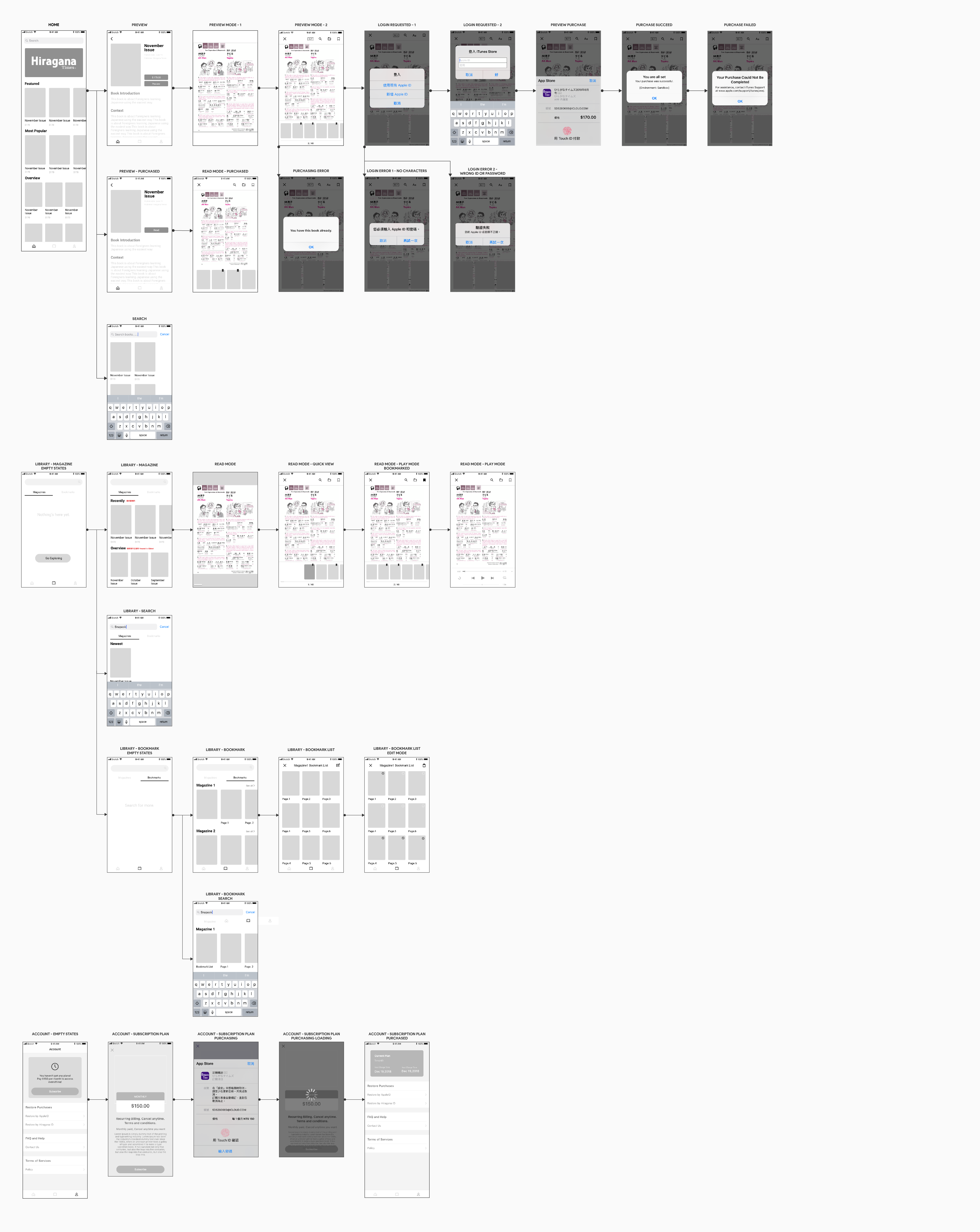
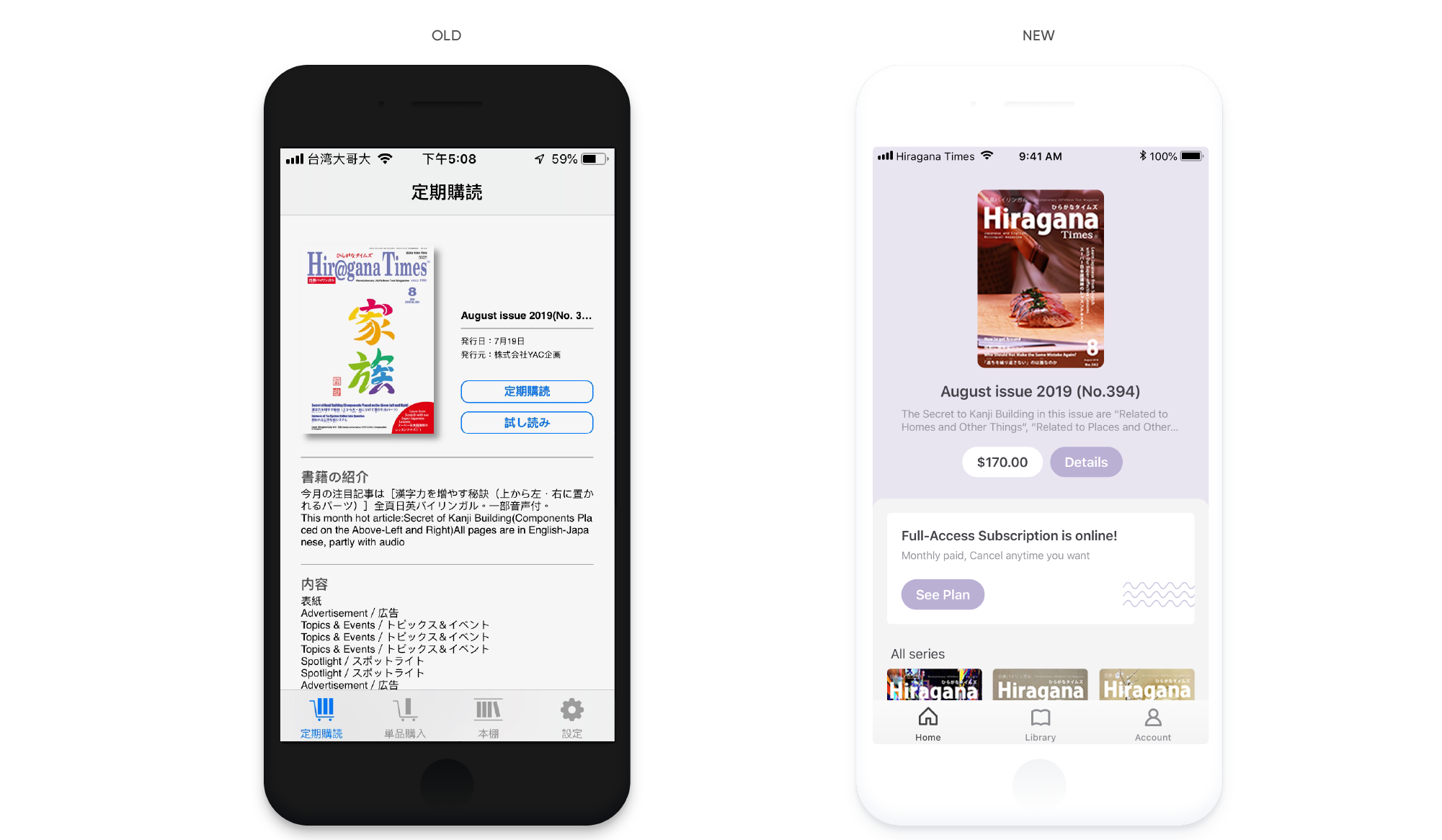
New home, new focus
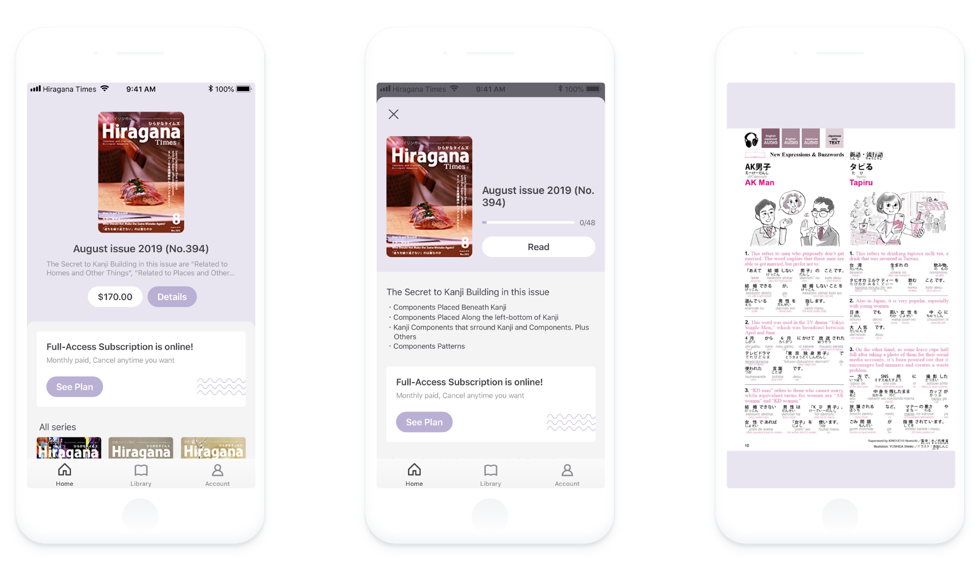
When homepage was first introduced, it only shows the subscription plan with magazine being promoted. Letting user know Hiragana Times' value at first sight is a must-achieved goal. By emerging the original 2 tabs into one, the new design refocuses the experience and able to provide more values on home. Users could see the magazine being promoted, subscription plan and all the contents on new home. which gives them more reason to stay longer and explore.
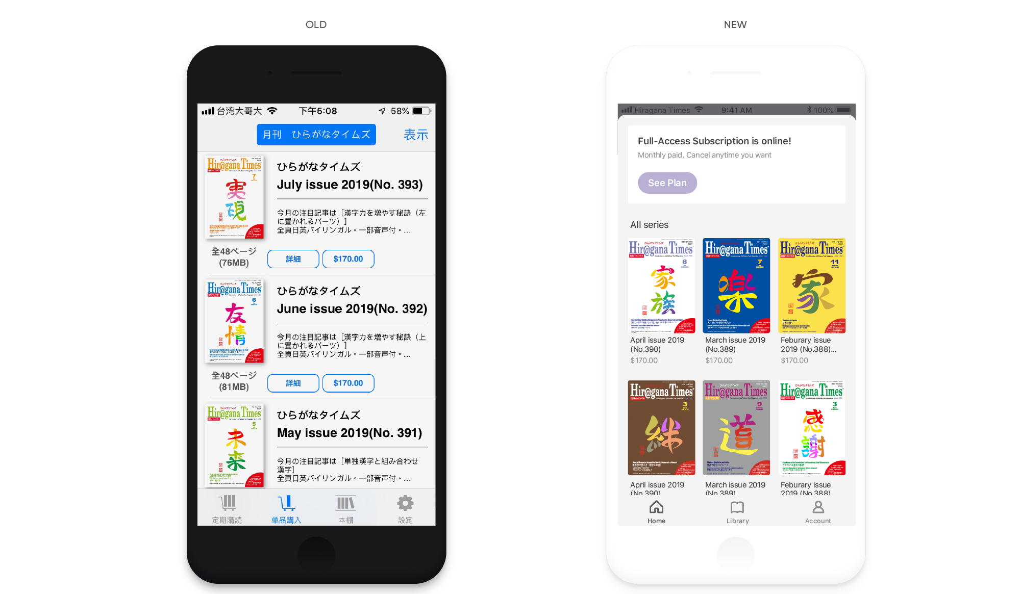
Tidying up, wider view
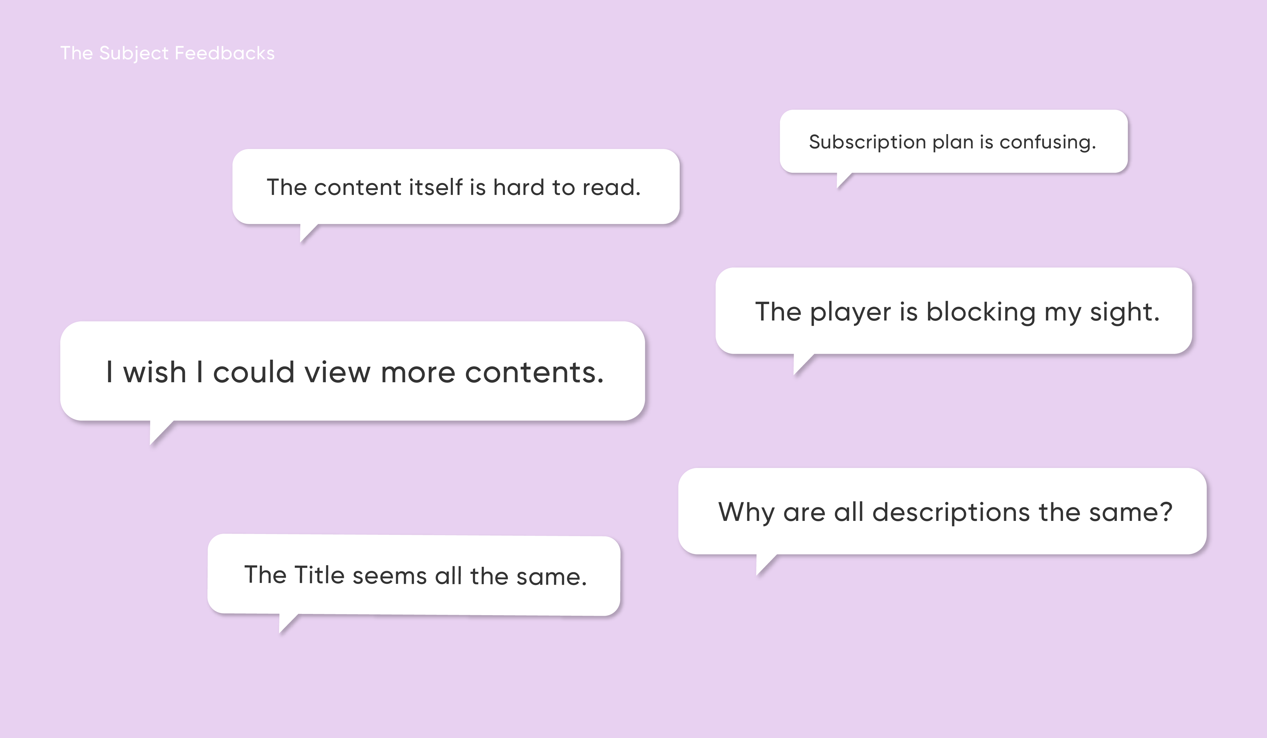
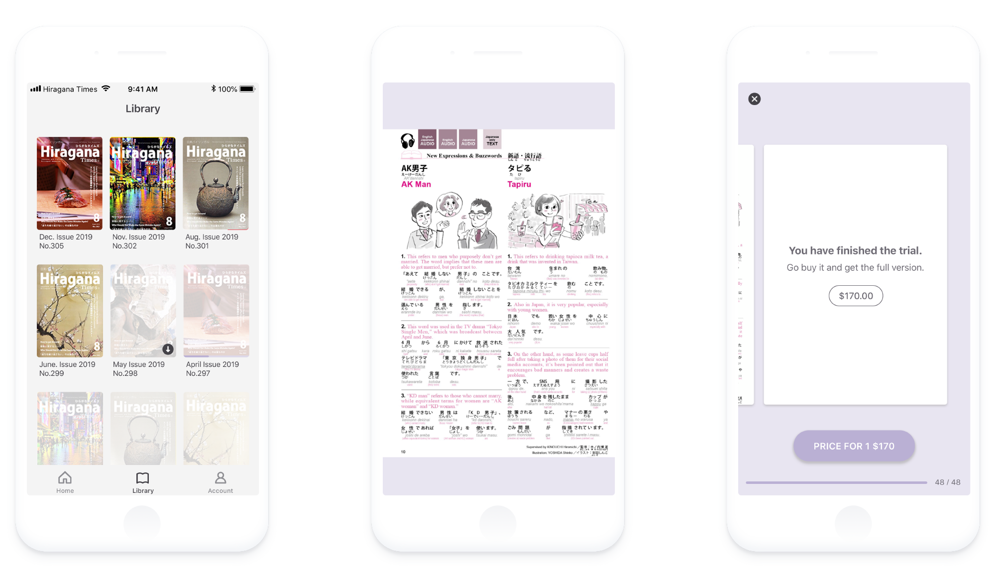
Through research we found out when users browsing, they tend to search for more contents instead of closer details of each one. Although old version provides details of each book, users could not benefit from this design. Cutting off those extra informations enables us to show more contents. The new design giving users what they want: wider range of contents.
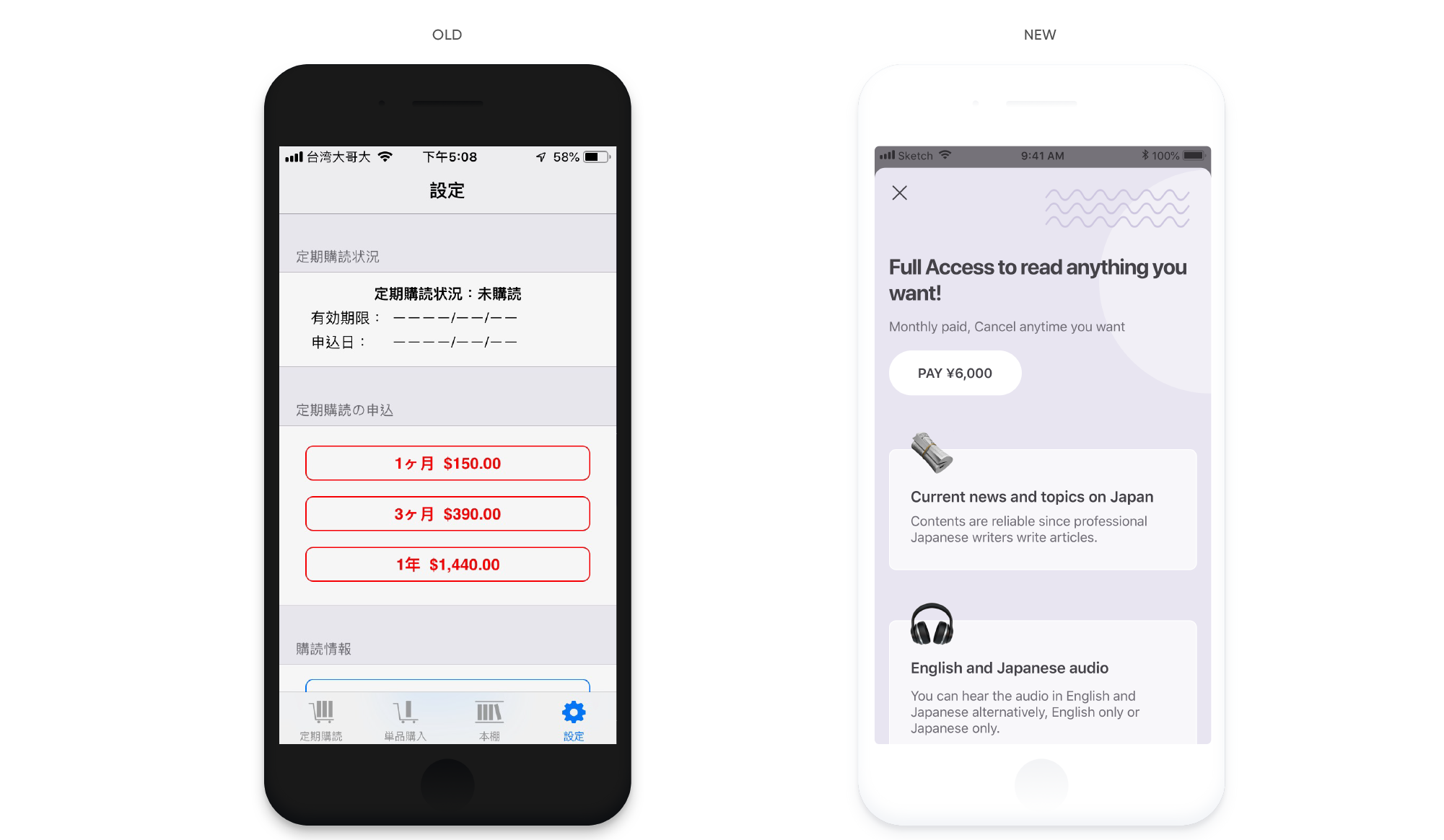
Fresh look, clear value
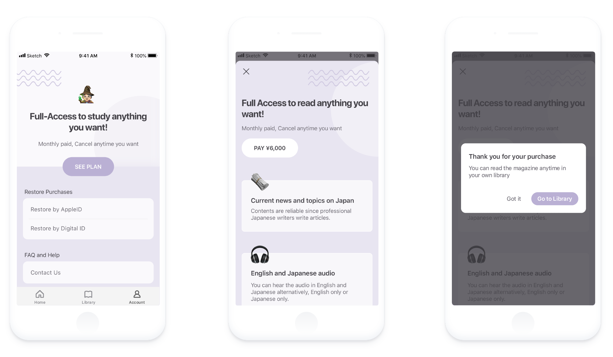
Subscription plan is a new point we wanna focus on. Old version just simply provides plans to user, which does not give user too much reason to pay. Design a new pricing page presents clear value is our solution. By creating a new page, we are able to explaining clearly what values could be brought on after purchasing.
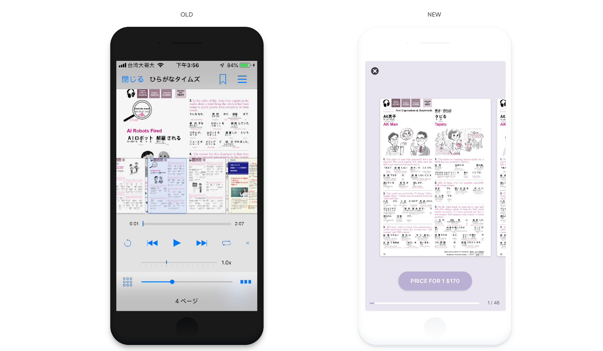
Reforming reading experience
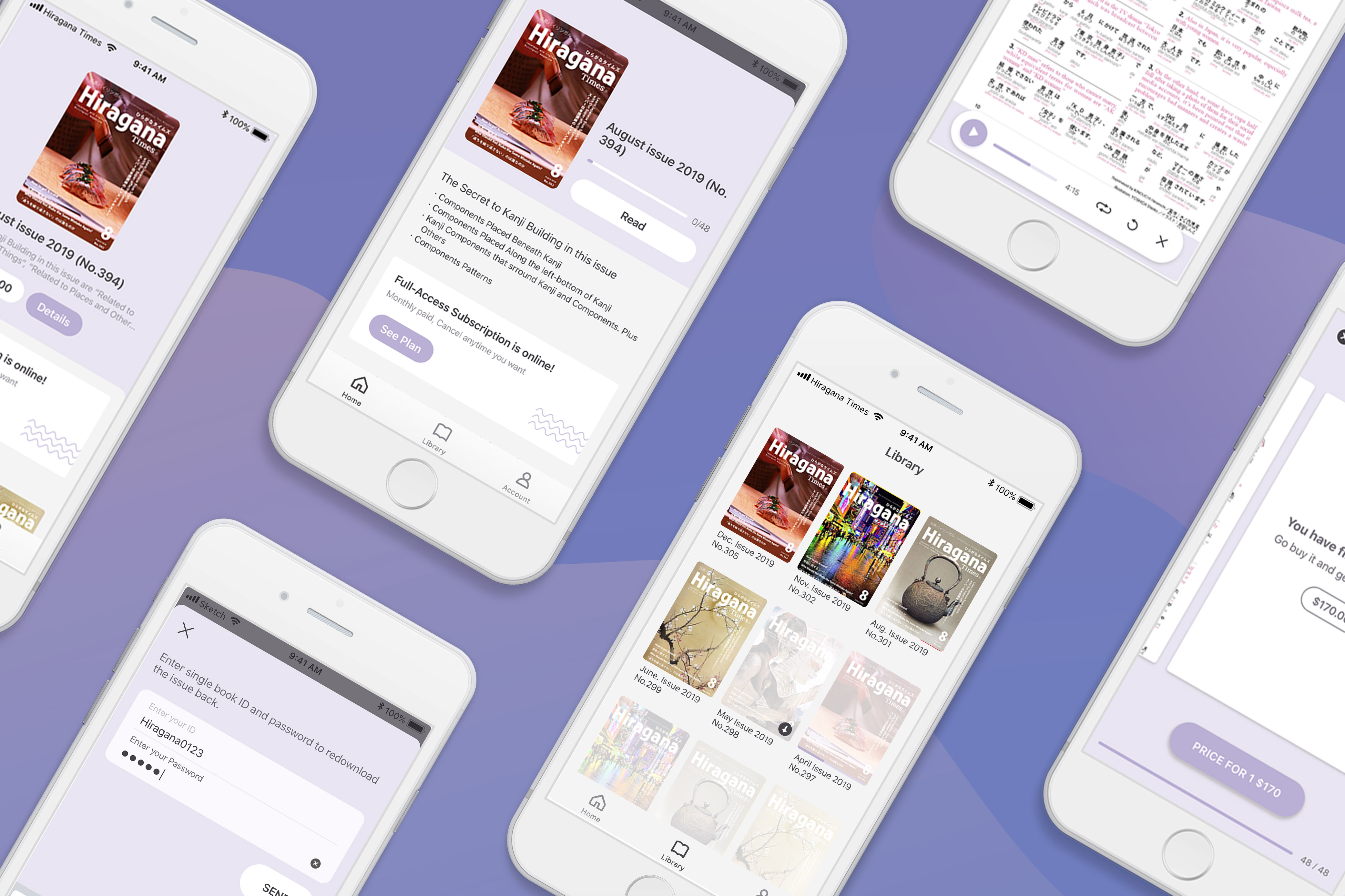
While reading you might wanna quickview to find the page you're interested in, or listening to the audio to help you know more about the content. but those features shouldn't be an interference while you're reading. Reading should allow users fully focus on the content. With the redesign of Hiragana Times, we’ve simplified the features by using a series of interaction design through gestures.

Swipe : Quickview

Pinch : Zoom in / Zoom out

Click : Audio Play
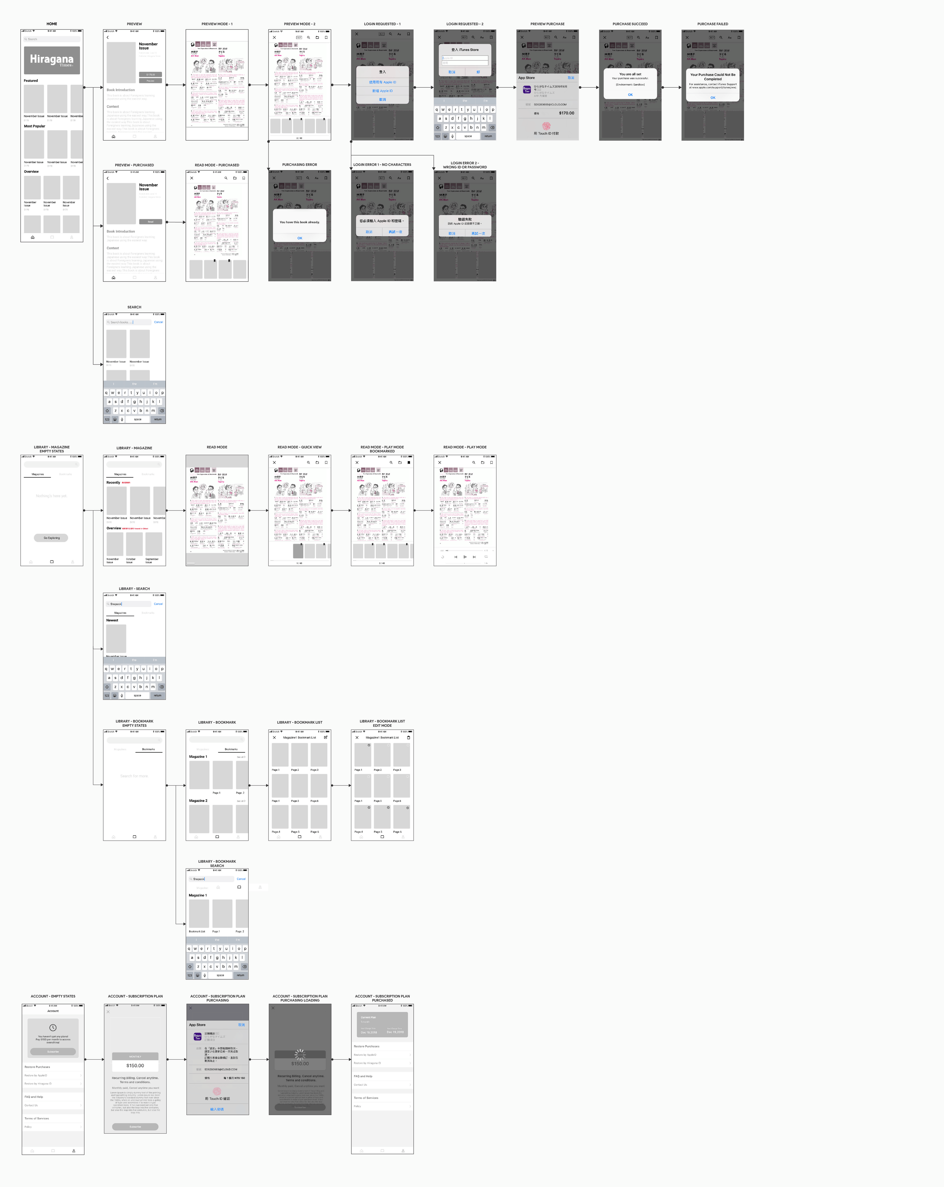
Mockups

